Homebuilder Website Design: What the Best Builder Sites Get Right
Most homebuilder websites are built to impress. The problem is they are trying to impress the wrong people.
A lot of builder sites are designed around the builder’s perspective like big logos, awards, and photography of smiling families in front of homes that sold two years ago. What they are not designed for is the person who just searched “new homes in [city]” and is now trying to figure out in thirty seconds whether this builder is worth their time.
That person does not care about awards. They want to see floor plans, price ranges, and available communities and fast. If your site does not give them that, they go to the next builder on the list. Most homebuyers do this three or four times before they pick up the phone.
The builders with the best websites understand something simple: the website is not a brochure. It is a salesperson that works around the clock. When it is built well, it qualifies buyers, earns trust, and drives conversations before your sales team gets involved. When it is built poorly, it sends buyers somewhere else.
Here is what the best homebuilder websites get right.
Why Homebuilder Websites Fail Before Anyone Calls.
The single biggest mistake on homebuilder sites is treating the website like it comes after the decision, not before it.
Most buyers start online, narrow their list online, and rule builders out online before ever setting foot in a sales center. Your website is often the first impression and the last thing they check before calling. If it does not hold up under that kind of scrutiny, you are not in the conversation.
The problems we see most often:
- Community pages buried three or four clicks deep
- No pricing information anywhere on the site
- Floor plans that only exist as downloadable PDFs
- A mobile experience that was clearly never tested on an actual phone
- Hero sections featuring photography of homes that are no longer available
Each one of those is a reason for a buyer to leave. Most homebuilder sites have two or three of them. The best builder sites have none.
What a Homebuilder Website Actually Needs to Do.
A homebuilder website has three specific jobs.
Establish credibility fast. Homebuyers are making one of the largest financial decisions of their lives. The website needs to communicate that you are a builder worth trusting before it does anything else. This means strong photography of completed homes, a clear company story, and visible proof that other buyers have had a good experience.
Help people find what they are looking for without effort. Community name, location, price range, available floor plans, move-in ready homes. If any of those things require more than two clicks to find, you are creating friction that costs you leads.
Move qualified buyers toward a conversation. Every page should have a clear next step like schedule a tour, talk to a sales agent, get on an interest list for an upcoming community. Not a generic contact form buried at the bottom of the page.
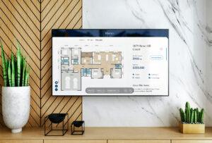
We worked with Imagination Homes, a David Weekley Homes brand, on an interactive TV kiosk platform for their sales centers – a digital product that let homebuyers browse floor plans and communities on a large-format screen in the sales office. The entire experience was built around one idea: give buyers exactly what they need, exactly when they need it, without making them work for it. See how that project came together here.
The same principle applies to every homebuilder website we design.

The Pages Every Homebuilder Site Should Have.
A generic agency will build you a home page, an about page, and a contact page. A homebuilder site needs more than that — and the pages beyond the homepage are where the real work happens.
Community Pages. One page per community, and it needs to do real work. Location, price range, amenities, a map, available floor plans, community photos, and a direct path to schedule a tour or talk to someone. These pages are also where your SEO happens because buyers are searching “new homes in [neighborhood]” land here, not on your homepage.
Floor Plan Pages. Floor plans should live on the website, not as downloadable PDFs. Each plan gets its own page with square footage, bedroom and bathroom counts, key features, and photos or renderings. Buyers spend more time on floor plan pages than anywhere else on a builder site. Build them like they matter.
Model Home Pages. If model homes are open, they get their own pages with address, hours, what is included in the model, and a clear path to book a visit. Buyers who are close to a decision look for this.
Move-In Ready Listings. A dedicated section for homes that are complete or nearly complete, with address, price, square footage, and photos. This is one of the highest-converting sections of any builder site. Buyers who need to move on a specific timeline go straight here.
Process and About Page. Who you are, how you build, what the experience is like from contract to close. This is where you earn trust. Testimonials from past buyers belong here. So does anything that helps a buyer understand what it is actually like to build with you.
What Makes Homebuyers Stay and What Sends Them to a Competitor.
Speed. A homebuilder site that takes more than three seconds to load on mobile will lose a significant portion of its traffic before a single page loads. This is not optional. Run your site through Google PageSpeed Insights and take the results seriously.
Navigation. Buyers should be able to get from the homepage to a specific floor plan in two clicks. If your menu has five dropdowns and buyers still cannot find what they are looking for, the navigation is not working. Simplify it until it does.
Real photography. Renderings are useful, but photography of completed homes is what moves people emotionally. A buyer looking at your site is trying to picture their life in one of your homes. Real photography of finished, furnished interiors does that. Stock imagery does not.
Visible pricing. Pricing with homebuilders is complicated including base prices, lot premiums, options, upgrades. We understand that. But “starting from $X” on every community page is better than no number at all. Buyers who cannot find any pricing information will assume it is out of their range and leave. Give them something to anchor to.
The builders who get these four things right do not just get more leads. They get better leads from people who have already done their research, already know what they want, and are ready to have a real conversation when they call.

What the Build Process Looks Like.
Homebuilder web design is a different kind of project than a standard marketing site. There is more content to structure, more page types to account for, and an ongoing need to update like new communities open, floor plans get revised, model homes sell. The CMS has to be set up so your sales and marketing team can make updates without touching code.
At Terrain, a homebuilder website project includes strategy and architecture to map out every page type and how they connect, a visual design system built around your brand, development on WordPress with a content management setup your team can actually use, and structured templates for community pages, floor plans, and move-in ready listings.
Most projects run 10 to 14 weeks depending on the number of communities and floor plans.
If you are evaluating web design agencies for a homebuilder project, one question worth asking is whether they have built sites that require regular updates by non-technical teams. The answer tells you whether they understand the category or are treating it like any other website project.
Learn more about how Terrain approaches real estate and residential web design.
Ready to Build Something Worth Selling From.
Your homes are worth more than an outdated website. If your site is costing you leads or you are a builder starting from scratch and want to do it right, let’s talk.