Fragrance Packaging Design for Modern Brands
Fragrance Packaging Design: How to Build a Product Brand That Works Beyond the Bottle
Most product brands treat packaging, branding, and ecommerce as separate projects. The logo gets designed first, then the box, then the website, then the marketing assets.
That approach can create a product that looks fine in pieces but feels disconnected as a full brand.
For a fragrance brand, that disconnect matters. Packaging has to communicate quality, story, and trust before someone ever smells the product.
Why Packaging Alone Is Not Enough
Packaging is often the first physical interaction someone has with a product, but it is rarely the only interaction. A customer may see the product on Instagram, visit the Shopify site, read the product page, receive the box, then use the bottle in real life.
Every one of those moments shapes how the brand feels.
If the packaging looks premium but the website feels generic, trust drops. If the website looks polished but the box feels underdeveloped, the product feels less considered. Strong product brands need every touchpoint to feel connected.
The WILDURE Challenge
WILDURE was built around a simple but specific idea: clean, bug-concious fragrance made for people who spend time outdoors.
The brand needed to feel premium without becoming too polished or delicate. It needed to feel natural without looking rustic. It needed to sit comfortably between fragrance, wellness, and outdoor lifestyle.
That balance shaped every decision across the identity, packaging, Shopify experience, and apparel.
Designing for the Environment the Product Lives In
Most fragrance brands are designed for shelves, vanities, and studio photography. WILDURE needed to feel believable outside.
That meant avoiding design choices that felt too cosmetic, too clinical, or too trendy. The system used a restrained palette, clean typography, and natural tones to create something calm, grounded, and easy to recognize.
The packaging needed to work in three places: on the shelf, in someone’s hand, and on a Shopify product page.
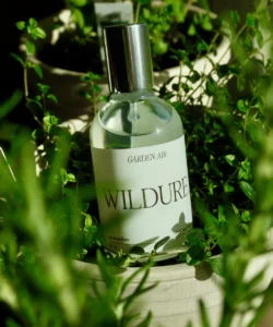
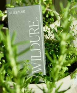
Building Recognition Through Simple Packaging
The WILDURE packaging system uses a minimal layout, strong spacing, and a clear hierarchy. The goal was not to over-design the box. The goal was to make the product feel considered.
The vertical wordmark gives the carton a distinct shelf presence. The bottle label keeps the core information simple and centered. The muted sage tone gives the product a natural quality without relying on obvious outdoor clichés.
This is the difference between minimal design and empty design. Minimal design still has to create recognition, structure, and product clarity.
Why the Shopify Site Had to Match the Packaging
A product brand does not end at the box.
For Wildure, the Shopify site needed to extend the same feeling as the physical product. The site had to introduce the concept quickly, communicate the clean fragrance positioning, and make the product feel trustworthy before launch.
That simplicity matters. A product site should not overwhelm someone with too many ideas. It should make the product easy to understand and easy to act on.
What Product Brands Can Learn From This
The strongest product brands are not built through one beautiful asset. They are built through consistency.
Before launching, founders should ask:
Does the packaging match the website?
Does the website match the brand voice?
Does the product feel believable in the environment where it will be used?
Does every touchpoint make the product easier to understand?
If the answer is no, the brand may feel fragmented before customers even try the product.
Final Thoughts
Fragrance packaging design is not just about making a bottle or box look premium. It is about building a system that can carry the product across every moment where someone encounters it.
For WILDURE, the goal was to create a brand that could live outdoors, look refined online, and feel consistent across packaging, apparel, and digital.
That is what modern product branding requires. Not just a logo. Not just a box. A complete system.
Launching a Product Brand?
If you are building a fragrance, skincare, wellness, outdoor, or CPG brand, the best time to align your brand, packaging, and ecommerce experience is before launch.
View the full WILDURE case study here: WILDURE brand, packaging, and Shopify website design.
You can view the live product experience at livewildure.com.